
This is the map as it appears in our gamejolt entry:
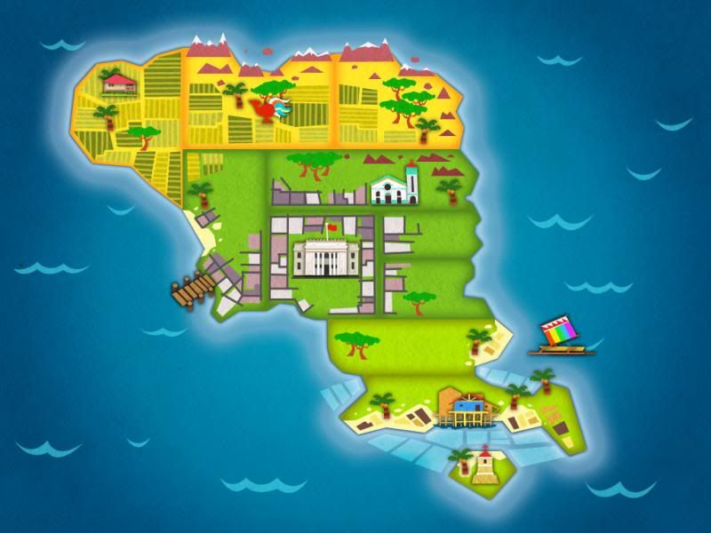
So generally speaking, people liked the look of it, though there were some comments on the color palette:
The rainbow sail is a unique palette and seems out of place.
The purple squares are competing with the buildings. If the purple grid pattern was darker, the buildings would pop.
Also a comment on the placement of some of the trees:
The regions are delineated but the parts are mixed together. Palm trees growing with deciduous/hardwood (sp?) and the same trees on both coasts.
The placement of trees was not really well thought out. I just figured that on an island this small, trees would grow in all sorts of places ( we don't quite have the same distinction of trees and seasons in the Philippines). But I realized that the placement of trees wasn't the real issue, it was that some of the districts lacked a sense of place. Except for the districts with large places like the kapitolyo and the churches, it was true that the districts did not seem very distinct from each other, so I set out to rectify that with my next iteration:

There were comments that were appreciative of the angular style that I had used, so to amp that up I replaced the gradients in the old coastline with more hard edged graphics. I added elements like the mine in the upper right corner to give a sense of place to the specific districts. I also removed the "outer glow" that I used on some of the landmarks. I initially did that in order to make them stand out, but now I'm thinking they stand out enough just being flat on the map, and it looks much more unified that way. Not sure if I'll stick to this but I like it so far. People liked the changes, but there were still a few more suggestions:
The black lines around the purple squares creates a lot of contrast and pops. The government buildings recede back when next to these purple squares, which may not be what you want.
Those black lines are supposed to be roads, and the contrast was intentional because I wanted the buildings to pop in the way the commenter mentioned. But this is a case of a single aspect of the whole standing out too much, for no real good reason. By simply removing the roads I made the map look much more unified:

This is not the final map by any means, and it will go through numerous changes as the game is developed. But hopefully this gives you an interesting look at how feedback can help you create better artwork!


0 comments:
Post a Comment